

Overview
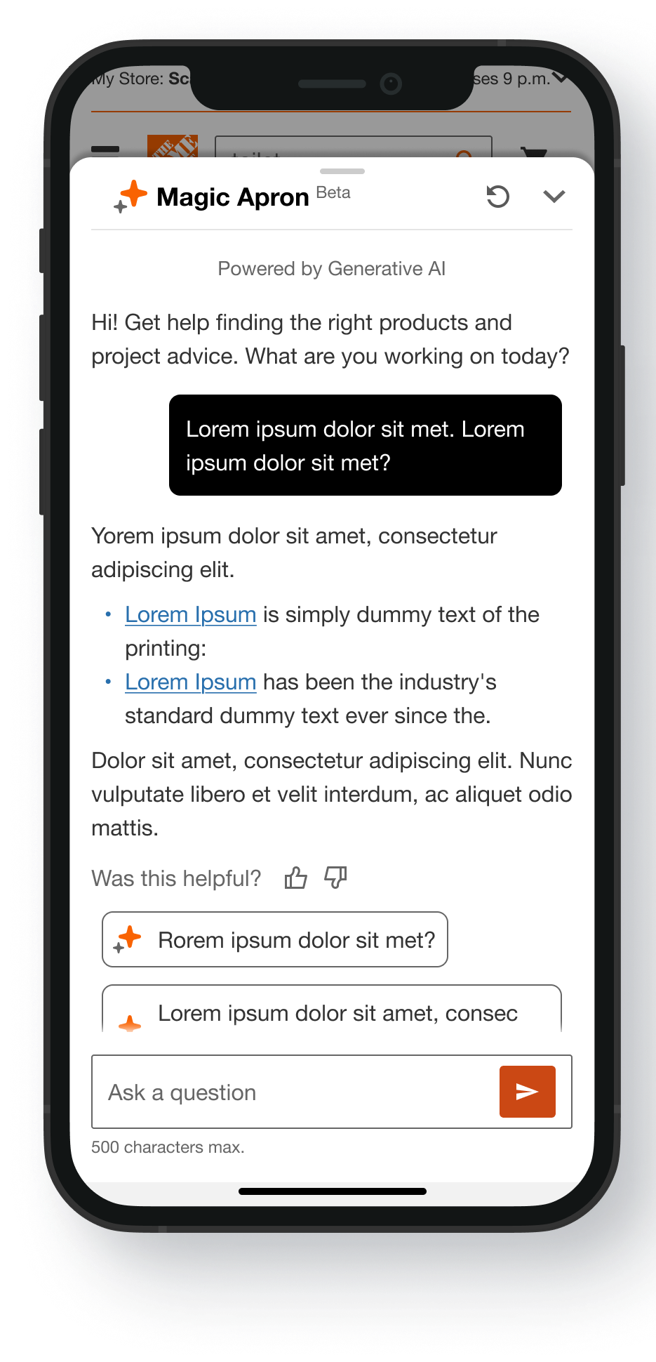
Magic Apron is a conversational AI interface designed to streamline the online shopping experience. By acting as a personalized digital guide, it helps users confidently navigate complex product catalogs and find exactly what they need to complete their projects.
Role
Translated project scenarios into user-centered mock-ups, presenting the iterative design process that shaped the final concepts.
Tools
Figma, Figma Make, Protopie, Miro, Quantum Metrics, and Adobe Analytics
Stakeholders
Product Managers, Dev/IT, Analytics
Timeline
40 days
Design Challenge
Deliver expert guidance through an AI shopping assistant to help customers find the right products without leaving the site.
Discover
Investigated conversational UX benchmarks and AI design patterns to align product behavior with user mental models. Key insights included:
Minimalism & Efficiency
Prioritize clean, compact layouts to reduce cognitive overload.
Trust via Transparency
Use active "thinking" states to communicate processing progress and build confidence.
Guided Interactions
Integrate pre-populated questions to lower user friction and spark engagement.
Persistent Accessibility
Maintain seamless access to the chat interface throughout the entire journey.
Value-First Strategy
Structure the UI around a direct "answer-first" or "product-first" delivery model.
Design Question
How might we introduce the feature more organically at key moments in the user journey to naturally drive higher engagement?"
Develop: Ideate & Decide
Ideation Ideas
Floating Action Button that opens the Magic Apron Assistant panel
Floating Action Button to be informative
Additional entry point in the header
Decide
To secure cross-functional buy-in, I translated the UX team's vision into interactive prototypes using Figma Make, an AI-powered design tool. By using AI to quickly generate real behaviors and interactions instead of static screens, we removed design ambiguity, caught technical and business friction early, and drove confident alignment across Dev, Product, and Analytics.
Final Designs
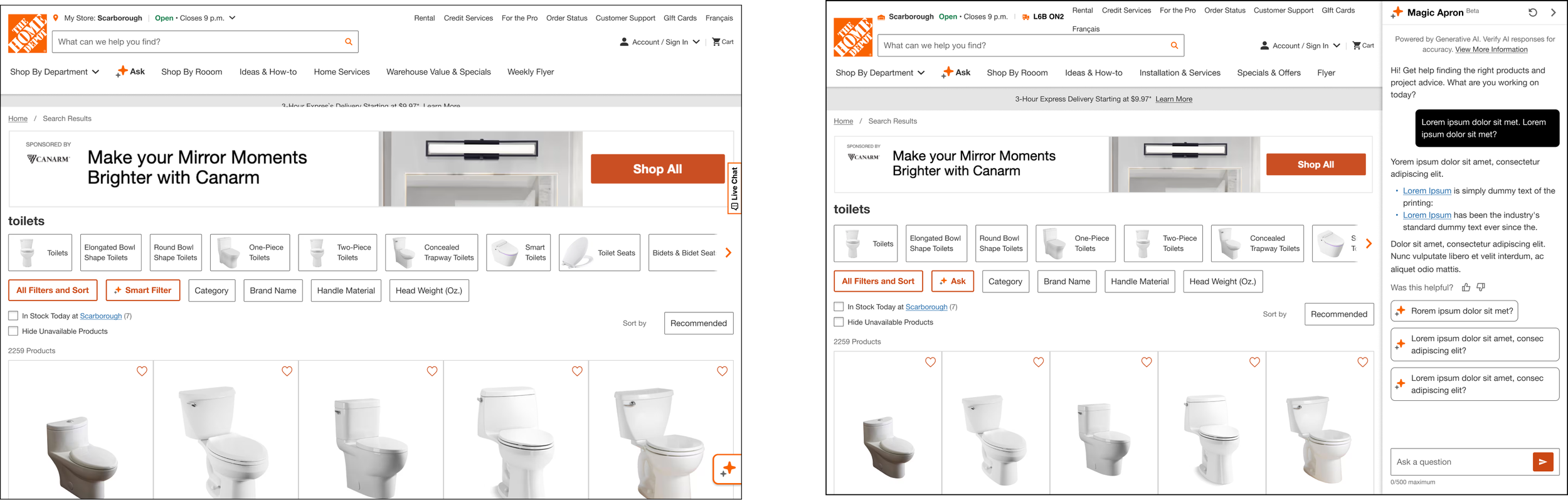
Placement & Integration of Magic Apron Assistant Entry Point
After deliberating with IT, Product and UX teams, we all aligned on the Floating Action Button being placed in the bottom right corner
Magic Apron Assistant panel will slide in from the right, readjusting the screen size of the main page to accommodate.
Navigational Elements Design
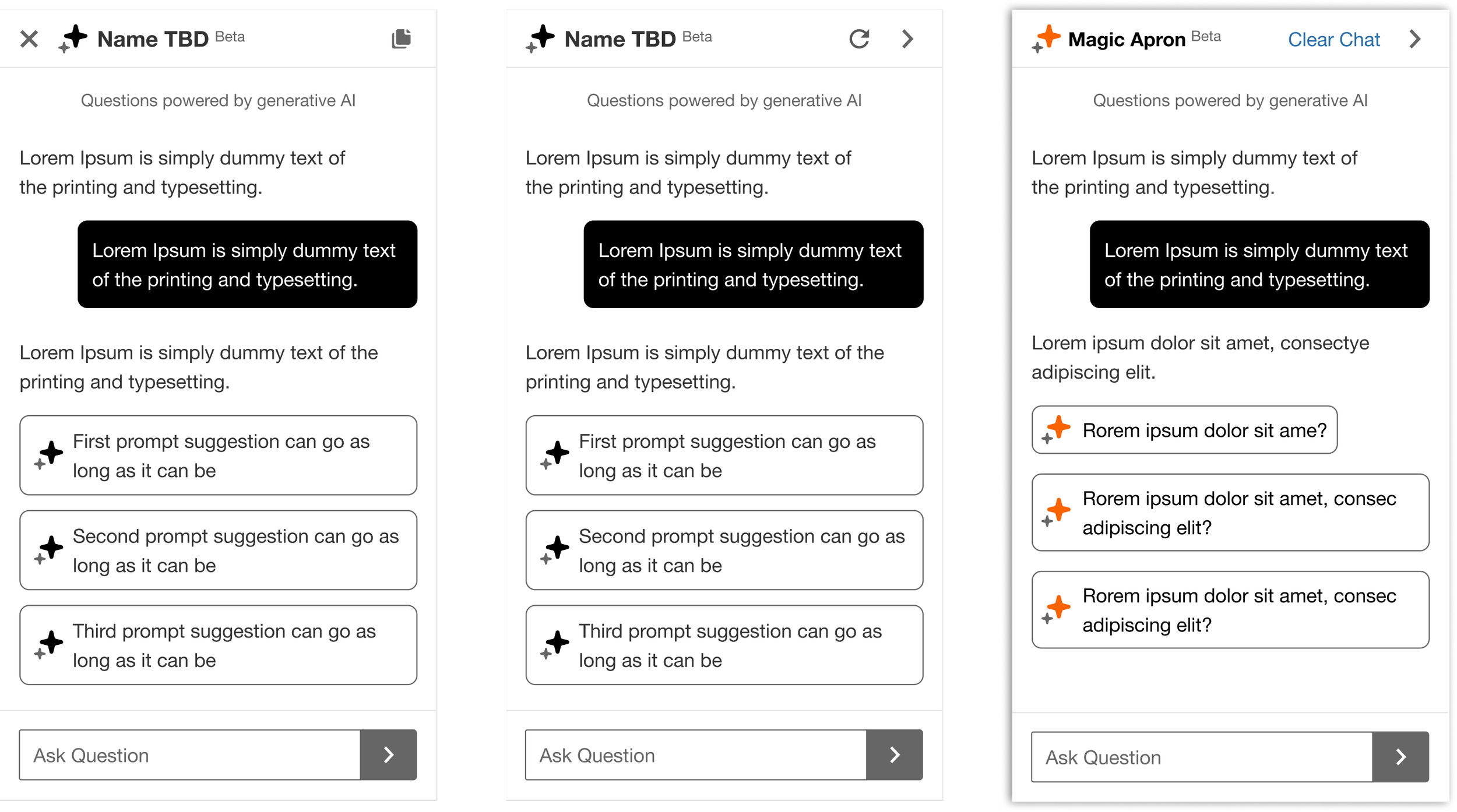
Icon Design Explorations (3 Left Images)
Navgational Elements
Considerations (3 right images):
Implementation of open/close logic for the panel
New Chat for users looking to start a new topic
Send Button for the input field
Icon Final Design Decision (Right Image)
Leveraged what we had within our design library for the ‘Clear Chat’ experience
Right pointing chevron to close panel
Send button updated to avoid confusion with the right pointing chevron
Message Rendering
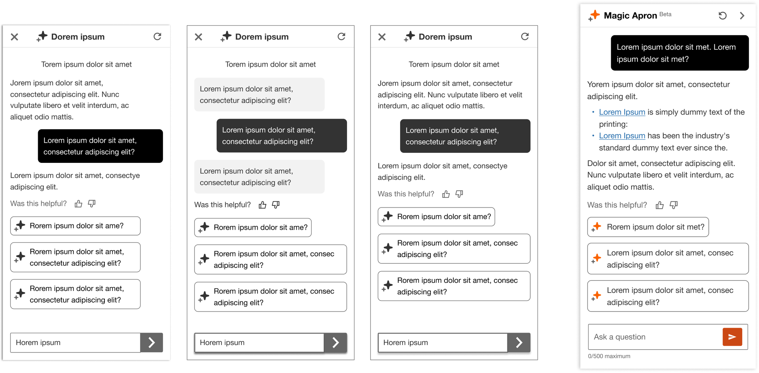
Design Explorations (3 Left Images)
Navgational Elements
Considerations (3 right images):
Spacing between user prompt then Ai response.
Copy design implementation i.e. chat bubble, text or a mix.
Chat bubble colour.
Width of both the User and Ai copy response.
Background colour of the panel.
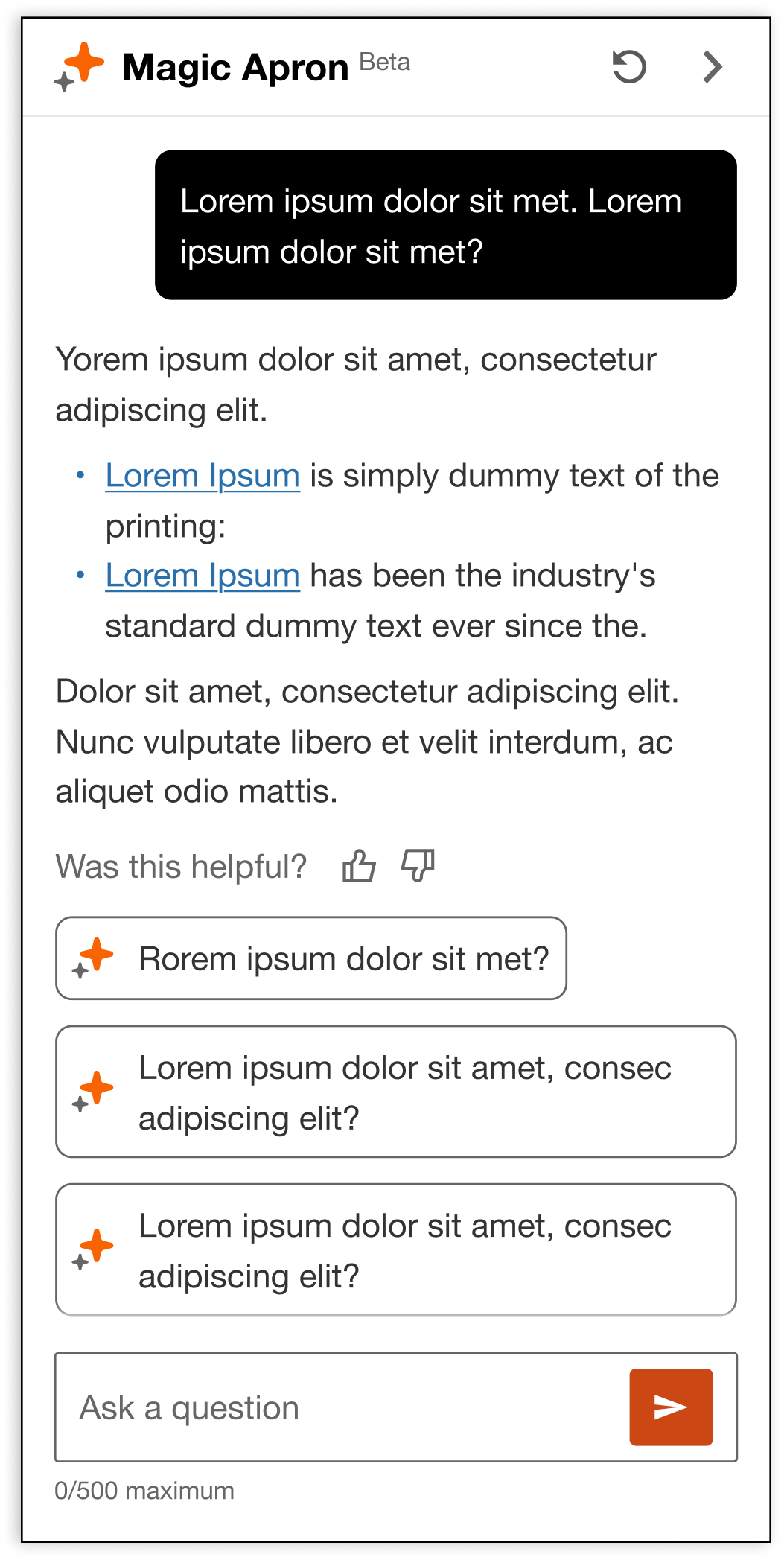
Final Design Decision (Right Image)
16px spacing between the User and Ai conversation.
Chat bubble for the user input. Text copy for the Ai response
Chat bubble color chosen as black to stay consistent with current Ai experiences live on the site
Full width for the Ai response to decrease the amount of scrolling due to long response
Kept it white to allow for smooth intergration of future features
Visibility and Entry Logic
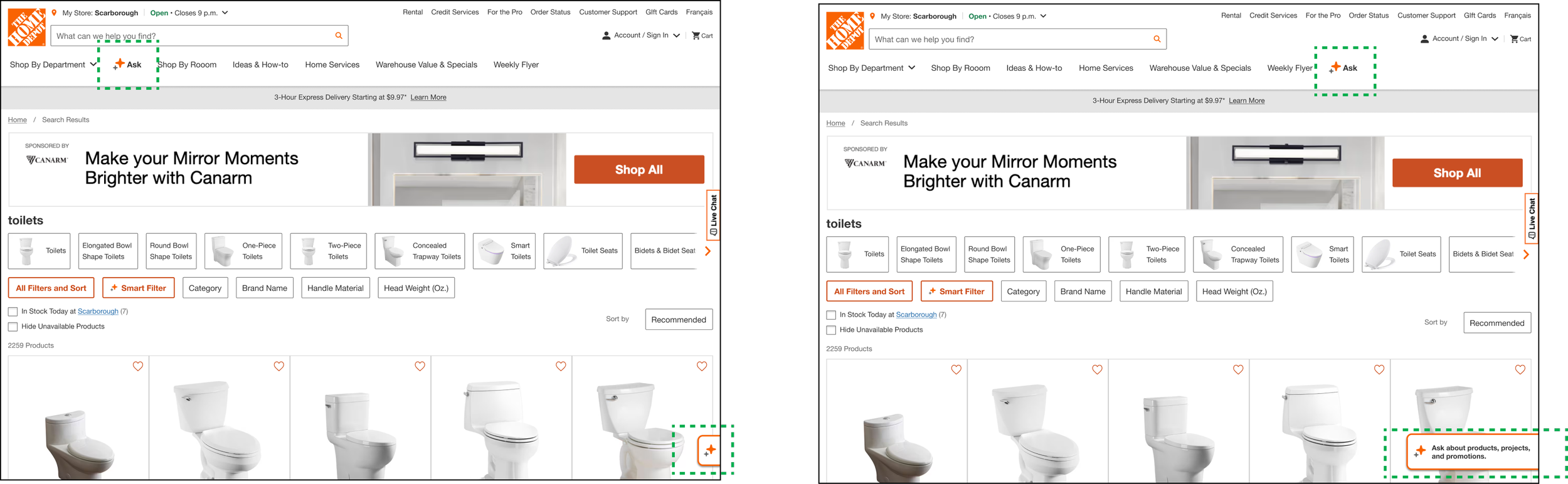
Design Explorations (2 Left Images)
Navgational Elements
Considerations (3 right images):
Adding an additional entry point within the header which would provide a consistent entry point to the Magic Apron Assistant across all the pages on the site.
A Moderated User Test was conducted to research the level of engagement with the entry points on the page.
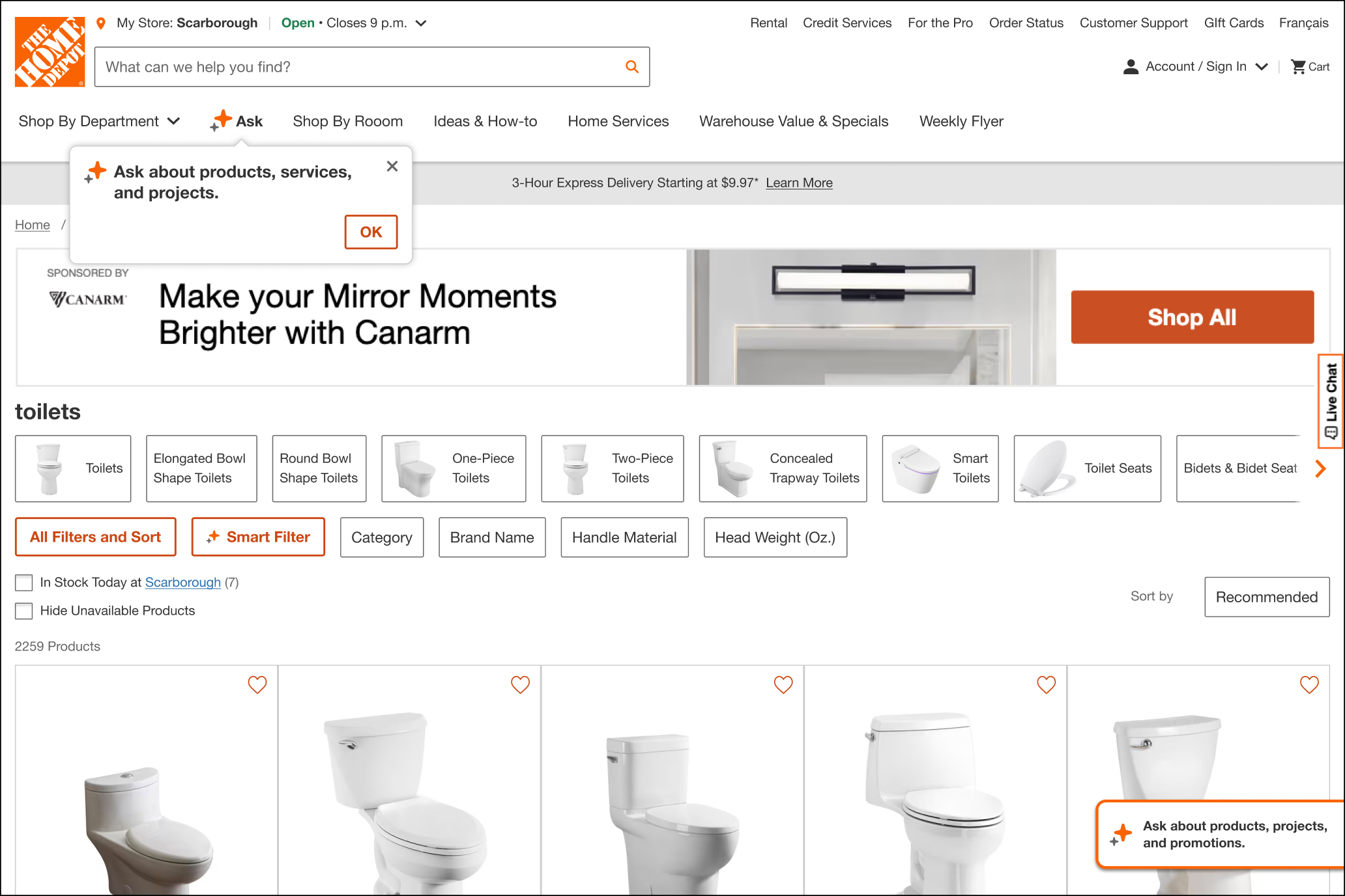
Final Design Decision (Right Image)
Designed a “Blurb” to draw awareness to the button in the header.
Included a CTA ‘OK’ to further drive awareness and track engagement. Once clicked on, the blurb would be dismissed permanently.
Teaser would start as a FAB, when the user scrolls below the fold, the teaser would open to display the message prompting user to engage, if needed.
Leveraged the same copy for both the Blurb and Teaser.
Live Chat Integration with Magic Apron Assistant
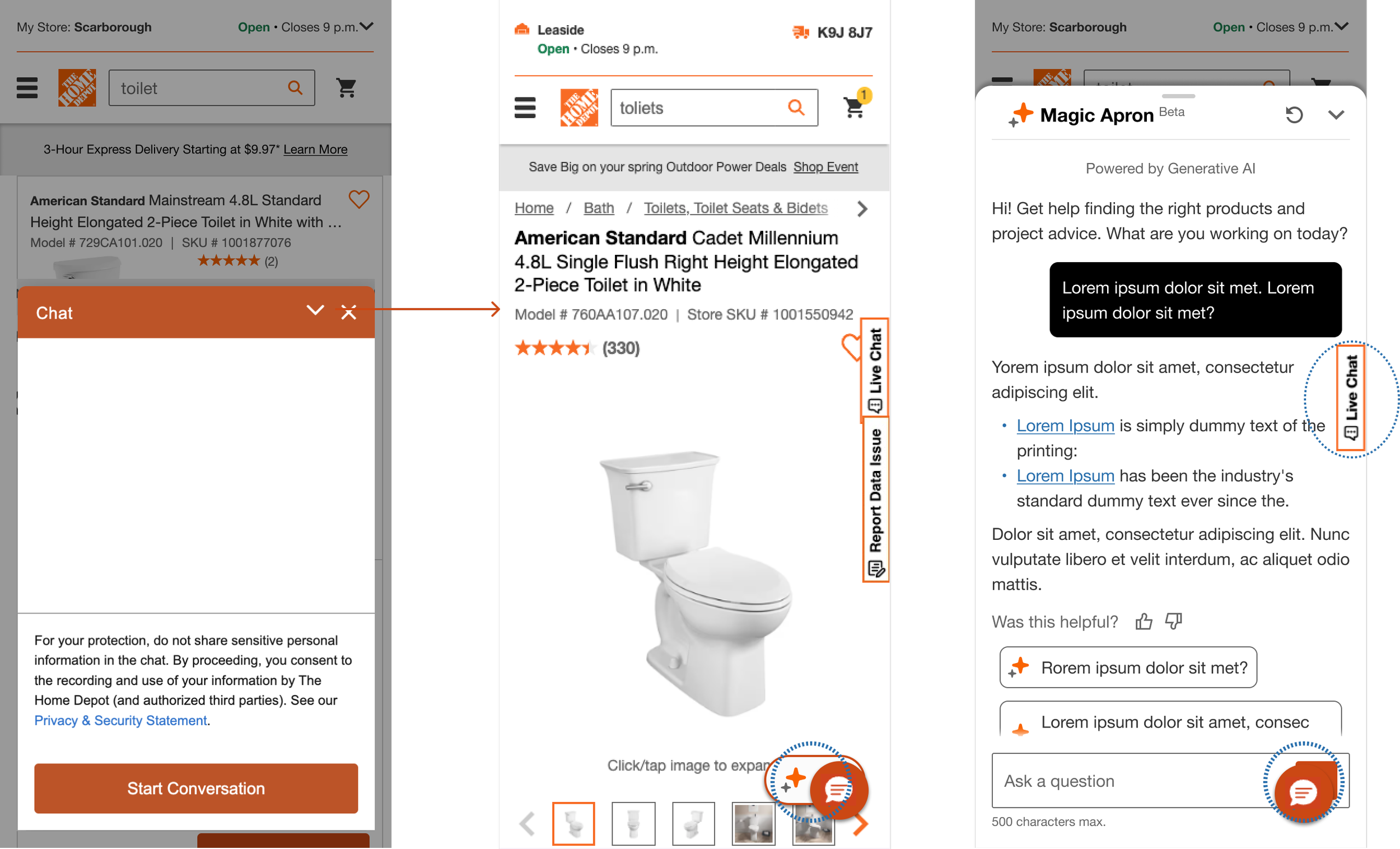
Design Pain Points with Live Chat (3 Left Images)
Navgational Elements
Considerations (3 right images):
Two modals living above one another with Live Chat & Magic Apron Assistant (1st image).
Magic Apron button and the Live Chat button will occupy the same space as user navigates the site (2nd image).
Live Chat button will live above the ‘Send’ button of the input field (3rd image).
Final Design Decision (2 Right Images)
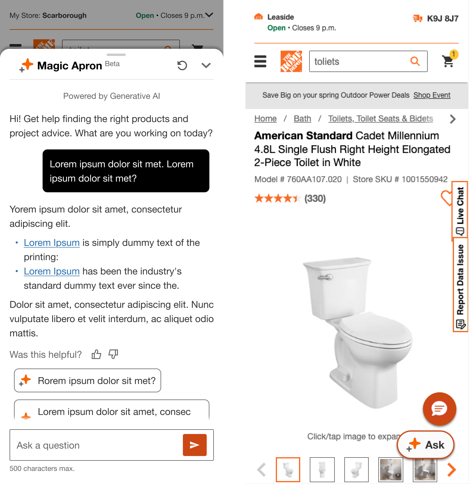
Magic Apron Assistant modal takes priority over Live Chat. Leveraging the same strategy with ATC panel, Filter & Sort...etc.
Live Chat button repositioned a bit higher to avoid overlap with the Magic Apron Assistant button
Product Card & Search Card Integration
Design Consideration (Left Image)
Navgational Elements
Considerations (3 right images):
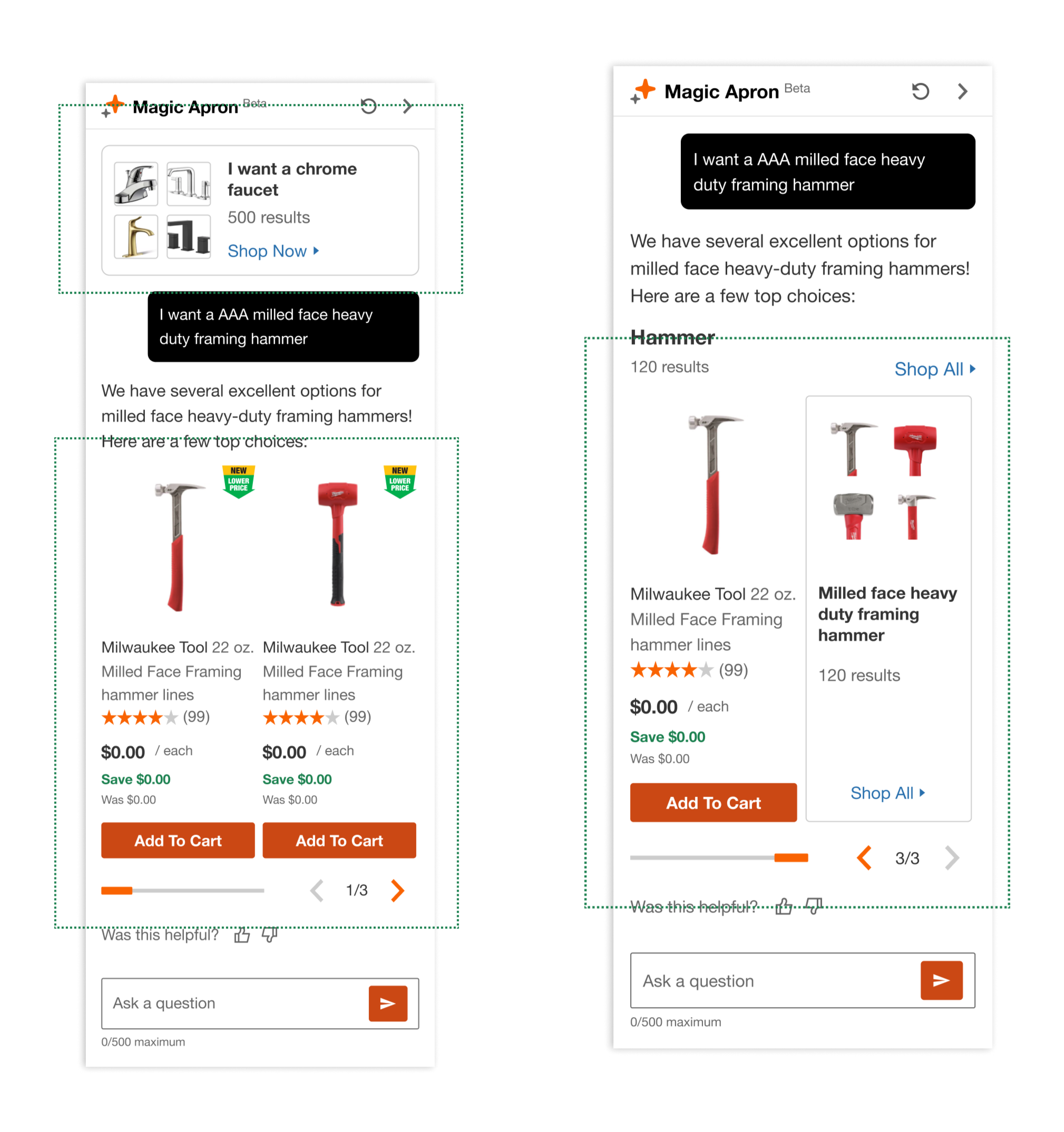
Product team wanted the Magic Apron Assistant to generate a browse card link and a product card rail. Depending on the prompt the user would be taken navigated to either a Product Landing Page or PIP respectively.
The US division had experimented with this strategy, but it did not perform well as the team could not accurately display the browe link vs the product card rail as per users expectations.
Final Design Decision (Right Image)
Designed a Browse Card that resembled the cards within the Product Rail and mergerd the two together.
Added a header, a total number of results, and a ‘Shop All’ link similar to what we see on a browse page. The familiarity of the features brings a level of familiarity to the user and ease of adaptabilty.
Future Considerations
Adoption Engagment
App users engaging with Magic Apron Assistant
Repeat usage across sessions
UX & Ai Performance
Feature Feeback (Thumb up/down)
Customer Satisfaction score (CSAT)
Business & Conversion
CR uplift: MAA users vs non-MAA users
Customer Conversion, Add-to Cart via Ai Chat
Next Steps
Bring the feature to the App experience
Integrate the feature to other page on the site: Cart and Check-out being a priority
I hope you enjoyed the read!
Happy to connect to further discuss my thought process and assess the potential of working with one another down the road :)